Deputy editor Paul Critcher explains how this month’s cover image was captured on camera
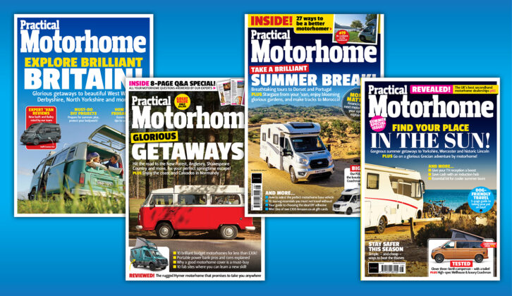
Cover images are a hugely important part of a magazine. They are our shop window where we can share highlights about the current issue’s content. Where we tantalise readers with the prospect of inspiring getaways, informative reviews and useful advice.
It’s a place where we can show how good we are and what value we give. Competitions, free inserts, reader offers – are all there to be promoted and shouted about. But it’s a careful balancing act. To create a successful cover, there needs to be a careful consideration of the placement and hierarchy of words and images, banners and logos, and mastheads and barcodes.
That creative process requires a highly skilled art editor who can showcase an inspiring alluring image, while at the same time drawing attention to other parts of the magazine. Those crucial elements might persuade the reader to pick it up from the newsstand and ultimately buy a copy. An action we thoroughly recommend, by the way!
Some, in fact most, of Practical Motorhome’s cover images take elaborate set ups with professional specialist photographers, a team of drivers and vehicles and well researched locations. They also require permissions to be secured for those locations and model releases.
Others, as is the case this issue, take advantage of an opportunity. A chance encounter with a place, good light and a moment in time that fortuitously presents itself.
Off to the Hebrides
I knew I would have the chance to shoot some good photos on a week-long trip to the Outer Hebrides. But a cover is wholly different proposition. Our magazine designers have exacting expectations about the type of images that go on covers. I would have to achieve a number of crucial elements to be in with a chance.
So I took advice from art editor Simon Mortimer about the sort of images I should be looking for. He advised on the type of content and shape I should seek. He also gave suggestions on the sort of settings and time of day at which I would be shooting. The most successful shots are invariably taken during the golden hours around dawn and sunset when the light is at its best
Cover photo wishlist
• A shot of a motorhome was a priority.
• Technically, it had to be framed properly, in focus and well lit.
• The photograph had to be in a suitably scenic setting to the sell the dream.
• It would be good to feature a person/s. Including people would show readers that too can experience this type of travel.
• The image would require negative space (an area around the main subject that is left unoccupied) for cover lines, logos and mastheads.
Location, location, location…
.
The Outer Hebrides is indeed a beautiful destination with myriad opportunities for great photography. That said, the weather can be mixed and at times relentlessly wet and grey. But I had no excuses in that respect. A touch of cloud at the beginning of the week transformed itself into glorious sunshine. Now to find the perfect location…
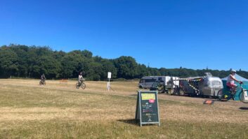
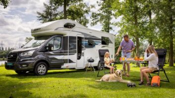
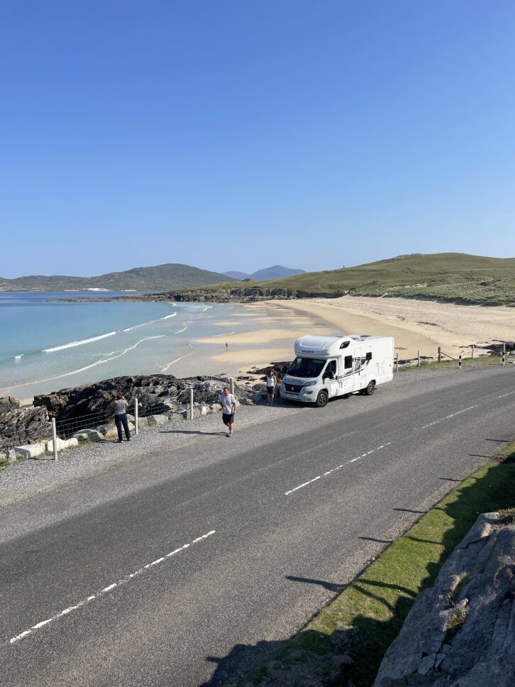
Over the course of the week I took a number of shots with cover images in mind. Essentially, they were thematically the same, with the motorhome we were travelling in in the foreground and scenery in the background. Sometimes with people standing next to the vehicle and sometimes without. I also took several at campsites with members of our group sitting at a chairs and table – reflecting life on site.
While they were decent images, I knew that few were real contenders. The scenery was not quite pretty enough, the motorhome not positioned correctly or the light too flat.
The right spot
We persevered, keeping an eye out for potential locations while enjoying our break away.
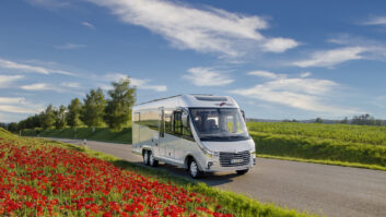
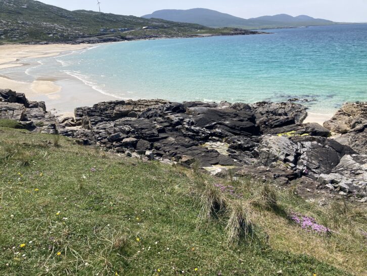
We spent arguably our best day on the islands at beautiful Nisabost Beach on Harris, where we went swimming in the North Atlantic before drying off and walking over the hills for views of more beaches and other islands in the background.
When we first walked up to the beach I spotted a great place for a photo – if we could find a parking space in the right position.
The perfect spot was occupied, but I knew if we returned early the following morning, we had a window of opportunity to take some photos when the light would be better and, hopefully, the parking space free. It really was only a ‘window’ of opportunity as we had to leave in time to catch the ferry later that morning.
Take the bloody shot!
Up and away early the next morning, and we were in luck – the parking spot was free. The sun was out and rising, the motorhome in prime position. The white sands on the beach below glistened beautifully, offset by the green hills and blue sky.
One of our group, Sean, took a high position on the hillside on other side of the road taking photos of Olivia and I as we worked out the best angle to capture all elements including plenty of blue sky to act as negative space.
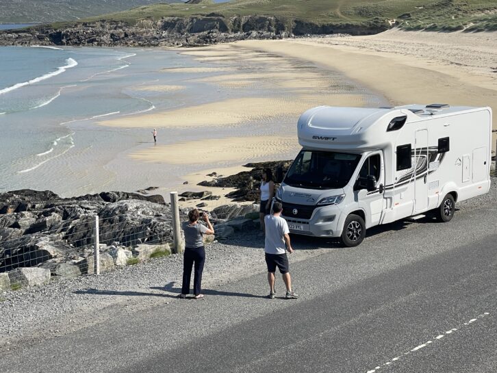
Carmelina, our model, was to provide the human interest. She looked suitably relaxed, in holiday shades and shorts and we tried a number of poses, including hands in pockets and pointing towards the view.
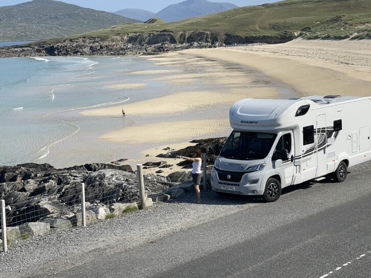
After several set up shots, we were ready to take the final image.
The decisive moment came (to be fair several decisive moments, as we took lots of images).
And, with our much recanted mantra ringing in my ears – “Take the bloody shot” – I took the photograph that would ultimately become our cover image.
Of course, that’s was only the beginning of the process. Now I had to hope that the team would select the image as cover. Fortunately, it was chosen and the design process could begin.
Simon’s design showcases the image beautifully, while promoting other parts of the magazine. Coverlines were written by group editor Sarah Wakely before the final version was presented to the rest of the team, along with the group art editor and brand director. Below is the final design of both the newsstand and subscription covers.
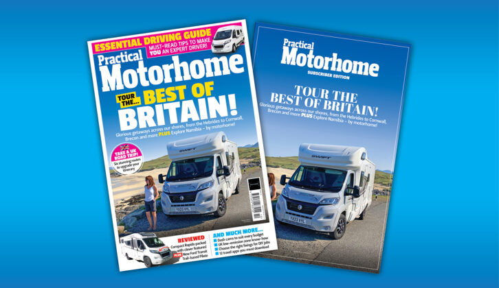
Photo credits Sean Perry and Paul Critcher
Magazine designers have exacting expectations regarding the type of images that go on covers